Thursday, May 26, 2011

Design Show & Final Piece

My design space was allocated in a corner of the room beside a screen as I wanted people to be able to hear the related song while viewing my design work. A lyrical slideshow also appeared on the screen provided to allow people to read the words and get a sense of the meaning behind the song.

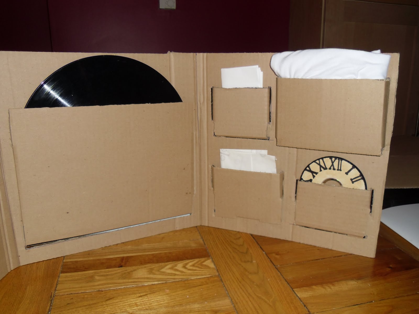
A small shelf was attached to my design board to house one of my record sleeves and a self adhesive hook was attached to hold the headphones for viewers to listen to the song while viewing the work. A table below was also used to showpiece previous years design work and to allow people to look through another record sleeve I created on different colour card.


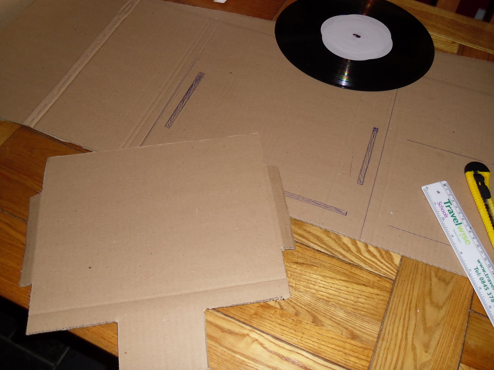
The final record sleeve was created by printing the full front and back cover to the required measurements on large format matt finish paper. This print-out was then spray mounted onto previously bought card and the required flaps and folds were scored into the card and marks and measurements were carefully drawn out. The card was then trimmed to the appropriate sizes.


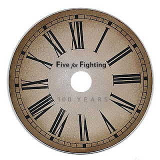
The lyric book and branded poster were also printed on matt finish paper scored in the required fold positions and stapled in the middle (only lyric book). The curved lips were created by cutting slits around a large circular dinner plate for the vinyl slot and saucer plates for the two smaller corner lips.

The inside holding flap was folded up inside the record sleeve, its previously created tabs folded in underneath and attached to the back cover by spray mounting once again. Once the glue was dried the vinyl, lyric book and poster were inserted into their appropriate lips or slots to complete the final memorabilia record sleeve piece.

Tuesday, May 24, 2011

Further Development of Branded Merchandise/Memorabilia

How the final Illustration and band branding could be rolled out across various merchandise and memorabilia was taken into consideration after the main record sleeve piece was created.

The Illustration was altered to fit promotional mugs and t-shirts. A Song Single Logo was also designed and applied to all pieces of associated media. Furthermore a mock-up CD front was designed in a clock face style to associate with the main illustration & also to highlight the main lyrical message of time.


Posters comprising the above elements were created for the design show to highlight these possible future directions for band merchandising and memorabilia. The main aim of the posters are to show how the final song illustration could appear if this project was a commercial venture.

Wednesday, May 18, 2011

Design Show Board Template


This image is to be printed (large scale) and put on display for our end of year design show. The top half shows my final year project design and development while the bottom shows various artwork from first semester and the minor projects module. To view my Minor Projects blog CLICK HERE.

Sunday, May 15, 2011

Packaging & Memorabilia Development

The CD front was designed to look like a clock face, as it was circular and this would tie in with the illustration design. A plain white sticker was stuck to the front of the CD and then stained with a tea bag to give it character and also to relate to the track message of getting older and time passing by. Adding Roman Numerals further strengthened the message of the track and made the CD look entirely like an old clock face.


The Design was also distributed across a t-shirt by hand drawing the modified illustration to fit the vertical t-shirt length. The t-shirt was edited using clothing markers that shrink the design to the t-shirt and remain permanent once the t-shirt has been ironed. This hand-drawn personal effect also ties in with the old feel of the entire piece.


It was then time to create the cardboard net for the record sleeve and memorabilia housing. The net consisted of 3 identically sized squares:
  • The left one for the front cover
  • The middle one to house the vinyl and
  • The right tab which folds inwards to house the required memorabilia
The sizes were marked out on a flat pack card board box and the required shape was cut out using a Stanley knife.


The spines and folds were created by marking each fold line on the cardboard and bending it around a square metal rod. The space for each item of memorabilia was then determined by their size and some markings for the cuts to be made to insert the required pockets to hold these pieces were made.


The front piece to hold the record in place was made by creating a separate tabbed piece of cardboard and attaching it to the centre panel of the folded sleeve. The size of this piece was determined by the dimensions of the vinyl.


The slots for the tabbed front to fit into were cut out of the main folded piece of cardboard. The tabs were folded when inserted through the slots and glued in place at the rear so as to be out of sight of the user.


The same process was then completed for the rest of the pockets on another folded section of the main cardboard piece. Each element had a specifically sized net constructed to hold it, the required slots were cut and the tabs pushed through and glued at the rear.


All the memorabilia was then placed into its required place within the sleeve to see how the finished piece would look when the user opened it up. The illustrated front cover (with cardboard background) was then attached to complete the prototype piece.

Friday, May 13, 2011

Packaging Ideas - Prototype Development

An entire record sleeve set like the Beatles set below is the desired outcome for the project with all related memorabilia housed within one final piece.


I looked at a number of nets and tried to think how I would design and fold my finished packaging piece so it would successfully hold all the required items while not taking up a great deal of space.

The above pizza box with included handle struck me as quite an ingenious design as the boxes are packed flat and built up when needed. Therefor the handle is part of the net and comes into play when required.


I looked at a few different Japanese packaging books having previously seen some of their work. All the packaging elements offered a personal touch and a neat and tidy finish which is what I would like to incorporate into my finished piece.


CD & Lyric Book Printing

I would like all memorabilia elements to encompass some part of the illustration so, like the examples I found below, I will try to brand all the delivered elements of the final packaging product. This will give some meaning to each individual piece so when they're put together as a collective the final product may be very desirable.


Prototype Packaging / Housing
I drew up the design for this piece and thought it looked quite well. However when it was constructed I decided it wasn't really practical as a package solution and would serve a better purpose as a more front of shop or above shelf one-off promotional display piece


Clock face centre piece, to tie in with the illustration, with arrows (clock hands) coming off to hold each piece of memorabilia. A central cardboard rod runs through the vinyl to hold it in place behind the clock face and a wooden rod runs through this to ensure the record doesn't slip off. Crocodile clips are attached to each arrow head to clip each piece of memorabilia into and hold them in place for display.