Alex Trochut a graphic designer and illustrator based in Barcelona.
He's worked with such clients as Coca-Cola, Fila, British Airways, Nike MTV etc.
His work is rich with elegant, brilliantly detailed executions that simultaneously convey indulgence, and careful restrained control. Trochut has a desire to constantly evolve and he prefers to steer clear of the modern notion of minimalistic design in favor of the 'more is more' approach.
I like the way Trochut involves the typography with the design as if the text is the main element and the design evolves around it. The use of bold colours also enables the main message to further stand out and achieve the main advertising goal for the client.
Saturday, March 26, 2011
Wednesday, March 16, 2011
Illustration Styles
Archan Nair A visual artist, illustrator and Art Director, specializing in mixed media, illustration, and digital art.
Archan is inspired by various phases and forms of life to create highly intricate works that connect the various dimensions of our existence.
His work for various companies and individuals around the world such include Canon, Nike, Tiger Beer, Sony etc. Archan has been featured in various publications including Computer Arts, Digital Arts, Advanced Photoshop, GQ, Bak, Vanity Fair.
The style of Archan Nair is very colourful and explosive mostly stemming from one anchor point drawing the eye up the illustration. For my final illustration design I would like to utilize these techniques to ensure the user successfully follows the lyrics of the song around the image while taking in each drawing of each section.
Friday, March 4, 2011
Illustration & Ideas
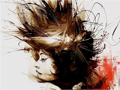
Head Illustrations: Dense focus of faces then explosions of abstract direction, colours and lines offer a very nice effect as they attract more attention to the anchor point - in this case the face.
Explosive illustration moves out from the body with lines, clouds and curves within the colours. Head blew off with ideas or stress possibly - colour quite red around where head should be could represent blood. http://theonlymagicleftisart.tumblr.com/post/3624113511/manhattan-zach-johnsen-18x24-graphite-and
Painting with Fireworks - Keeping the explosive theme the image to the right was created using Fireworks - a dangerous practice with unpredictable results to say the least, however the outcomes are mostly circular but none-the-less quite nice. More Surrealist Art By Rosemarie Fiore is viewable at the following address: http://www.trendhunter.com/trends/drawings-down-with-fireworks-surreal-art-of-rosemarie-fiore#!/photos/40638/4
Illustration - Type within a Flower
This drawing starts off as a simple root then expands into a wonderful bloom of leaves, curves, lines and colours to create a flower image with the Type embedded deep within. A lovely piece of illustration.
http://www.hellozso.com/work/tedx-brooklyn.html
Videos
The following videos are a couple of examples of different arrow usage to advertise different ideas and illustrate different points. The stress video uses strong danger colours and wavy arrows to illustrate chaos, mayhem and lack of direction.
Whereas the Corsa advert uses brightly coloured straight, block arrows to indicate a clear sense of direction. However it sometimes uses a lot of them, pointing in different directions to illustrate choice and a sense of freedom.
A few Ideas for different Arrow Illustrations - How they might look, direction etc.
http://www.shutterstock.com/pic.mhtml?id=58434178
Explosive illustration moves out from the body with lines, clouds and curves within the colours. Head blew off with ideas or stress possibly - colour quite red around where head should be could represent blood. http://theonlymagicleftisart.tumblr.com/post/3624113511/manhattan-zach-johnsen-18x24-graphite-and
Painting with Fireworks - Keeping the explosive theme the image to the right was created using Fireworks - a dangerous practice with unpredictable results to say the least, however the outcomes are mostly circular but none-the-less quite nice. More Surrealist Art By Rosemarie Fiore is viewable at the following address: http://www.trendhunter.com/trends/drawings-down-with-fireworks-surreal-art-of-rosemarie-fiore#!/photos/40638/4
Illustration - Type within a Flower
This drawing starts off as a simple root then expands into a wonderful bloom of leaves, curves, lines and colours to create a flower image with the Type embedded deep within. A lovely piece of illustration.
http://www.hellozso.com/work/tedx-brooklyn.html
Flowing Paint stem-like Painting/Illustration
I really like the curves and swirls used in this piece as they remind me of flowers and how their stems and leaves curl outwards. I also like how the lines go beyond the frame as if they cannot be tamed, much like nature itself.
http://thebackofyourmouth.deviantart.com/gallery/#/d181u6h
I really like the curves and swirls used in this piece as they remind me of flowers and how their stems and leaves curl outwards. I also like how the lines go beyond the frame as if they cannot be tamed, much like nature itself.
http://thebackofyourmouth.deviantart.com/gallery/#/d181u6h
Videos
The following videos are a couple of examples of different arrow usage to advertise different ideas and illustrate different points. The stress video uses strong danger colours and wavy arrows to illustrate chaos, mayhem and lack of direction.
Whereas the Corsa advert uses brightly coloured straight, block arrows to indicate a clear sense of direction. However it sometimes uses a lot of them, pointing in different directions to illustrate choice and a sense of freedom.
A few Ideas for different Arrow Illustrations - How they might look, direction etc.
http://www.shutterstock.com/pic.mhtml?id=58434178
Subscribe to:
Posts (Atom)